Gold Results
Corporate Identity, different projects 2018-2022
-
PROJECT SCOPE
- Visual Identity
- Logo
- Business Cards
- Presentations
- Visuals
- Info Graphics
- Homepage
Gold Results is an consultancy agency helping their selected clients in progresses of growpth and transformation with a focus on leadership culture. Experience from years in the sports world shaped the company's approaches.
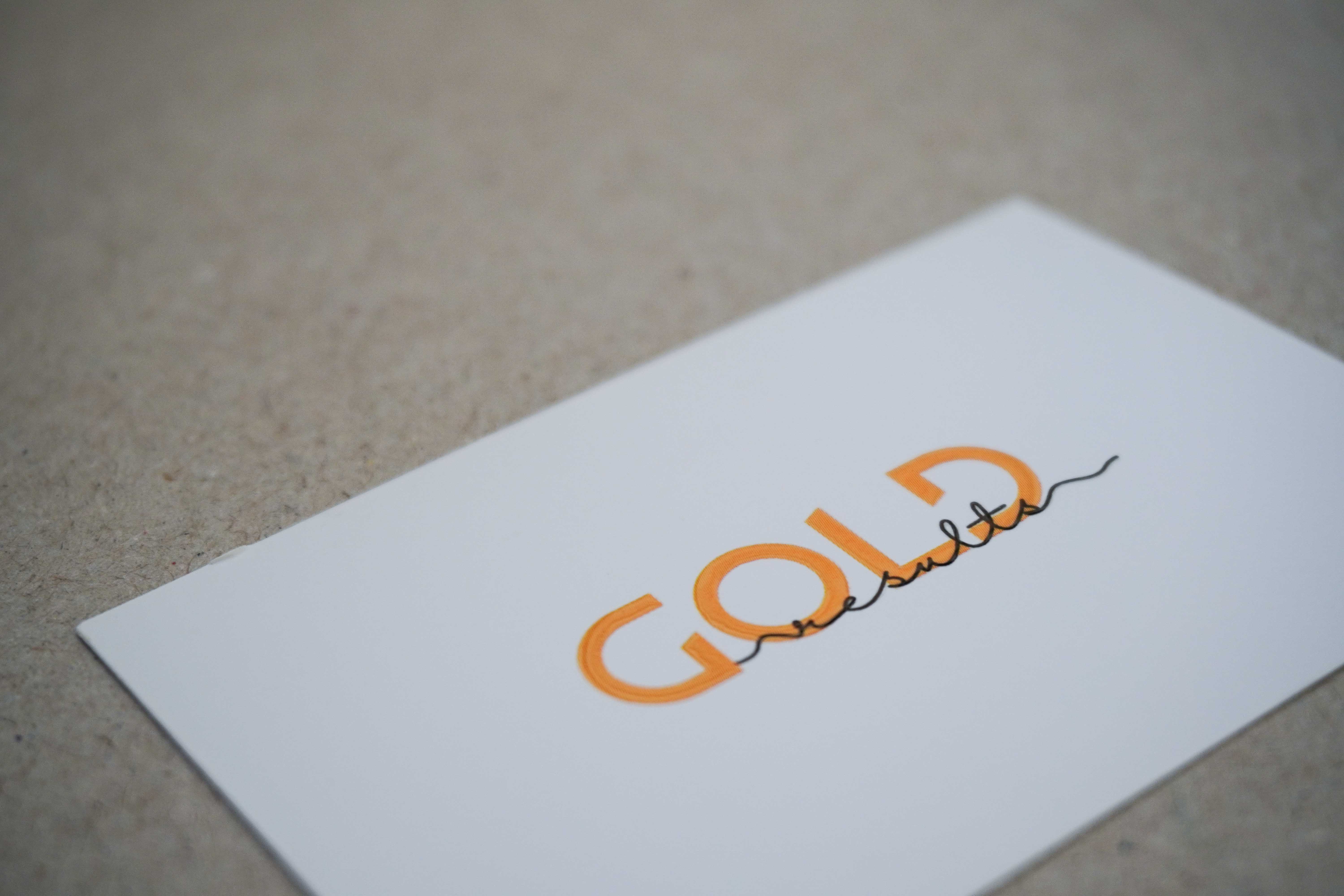
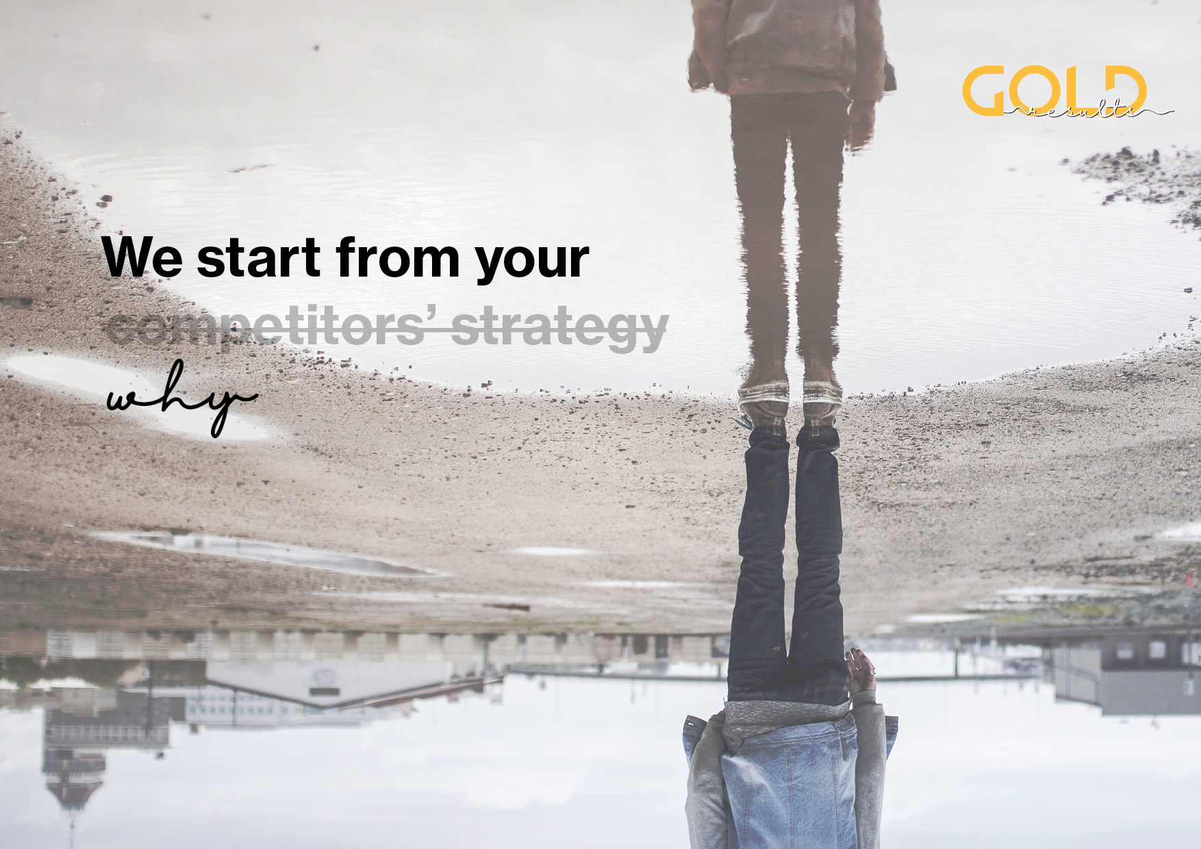
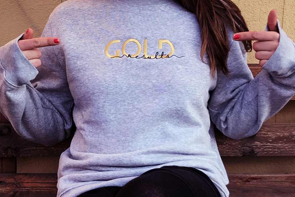
The old logo had quite an 80s PowerPoint aestetic and I proposed to start our cooperation redesigning it and built up a look around it. The letters draw an imaginary diagonal pointing upwards representing the process of growth replacing the former arrow. Gold Results treats each project and client as unique, so the handwriting was selected to reference that as well as to play with it in subbrands created over time and other occations.
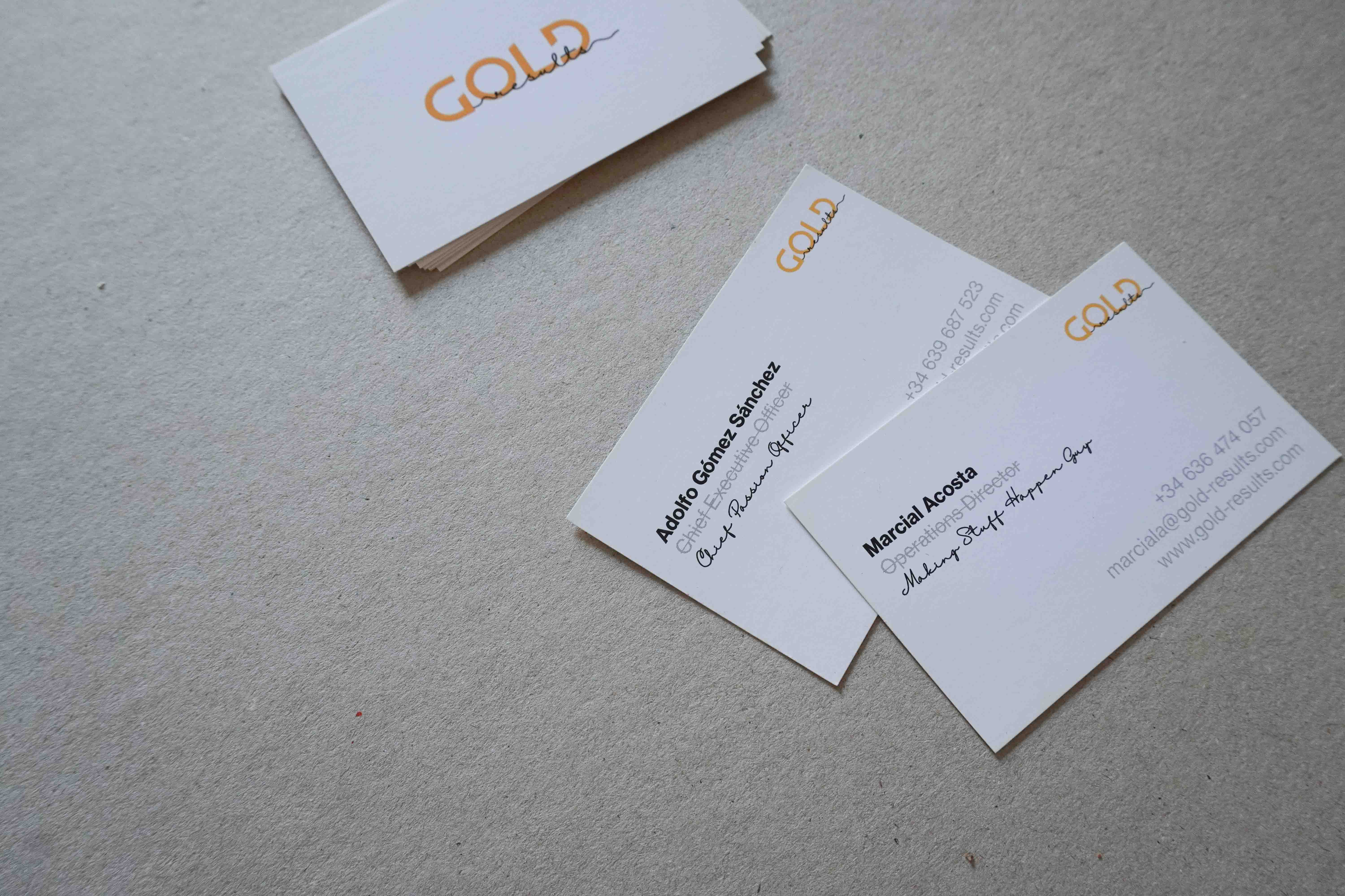
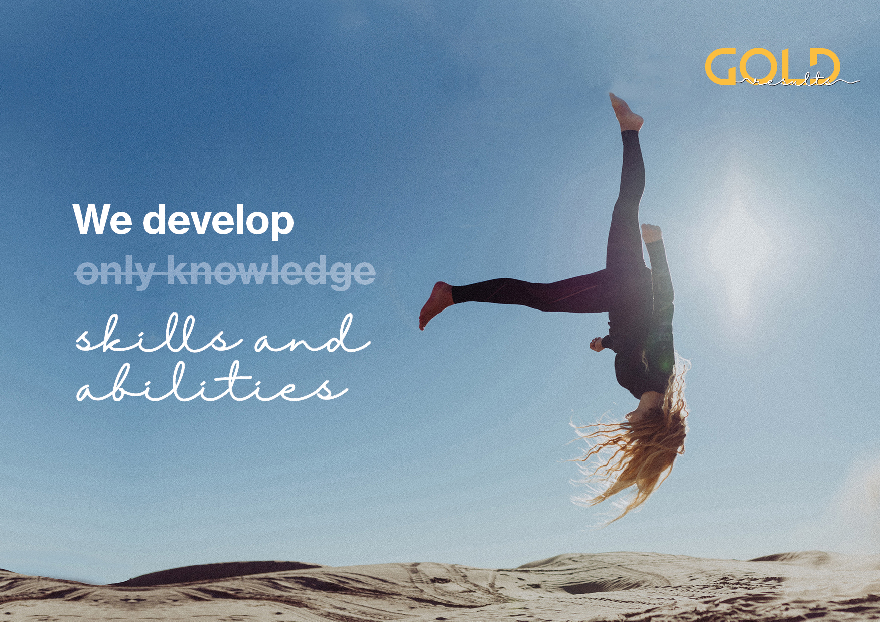
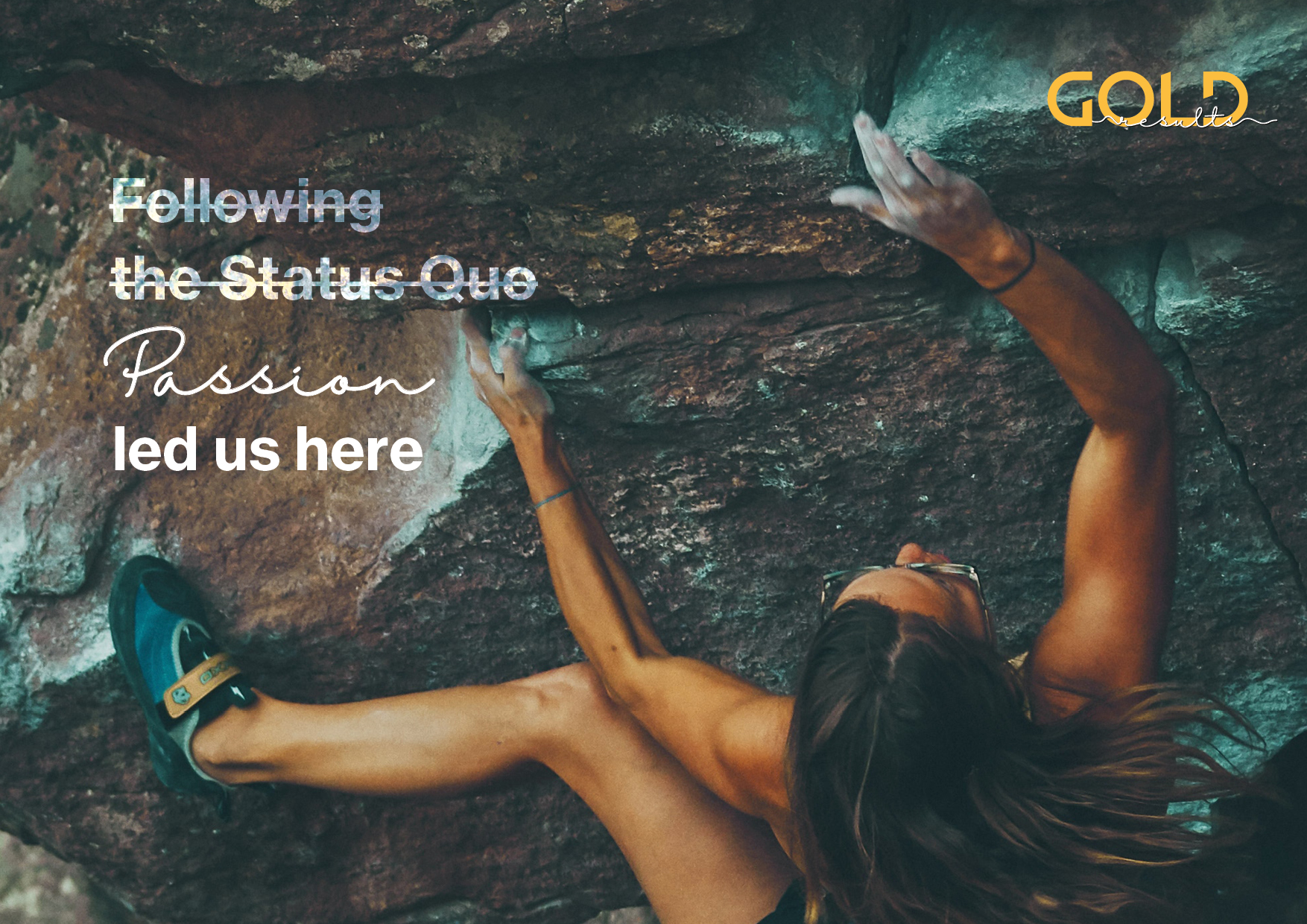
The first visual campaign was based on what represents Gold in differenciation to "the usual", expressed by crossed-out text and "handwritten" alternates. This system was also applied when designing the business cards – getting rid of boring, not really informative job titles and adding some humor to it.
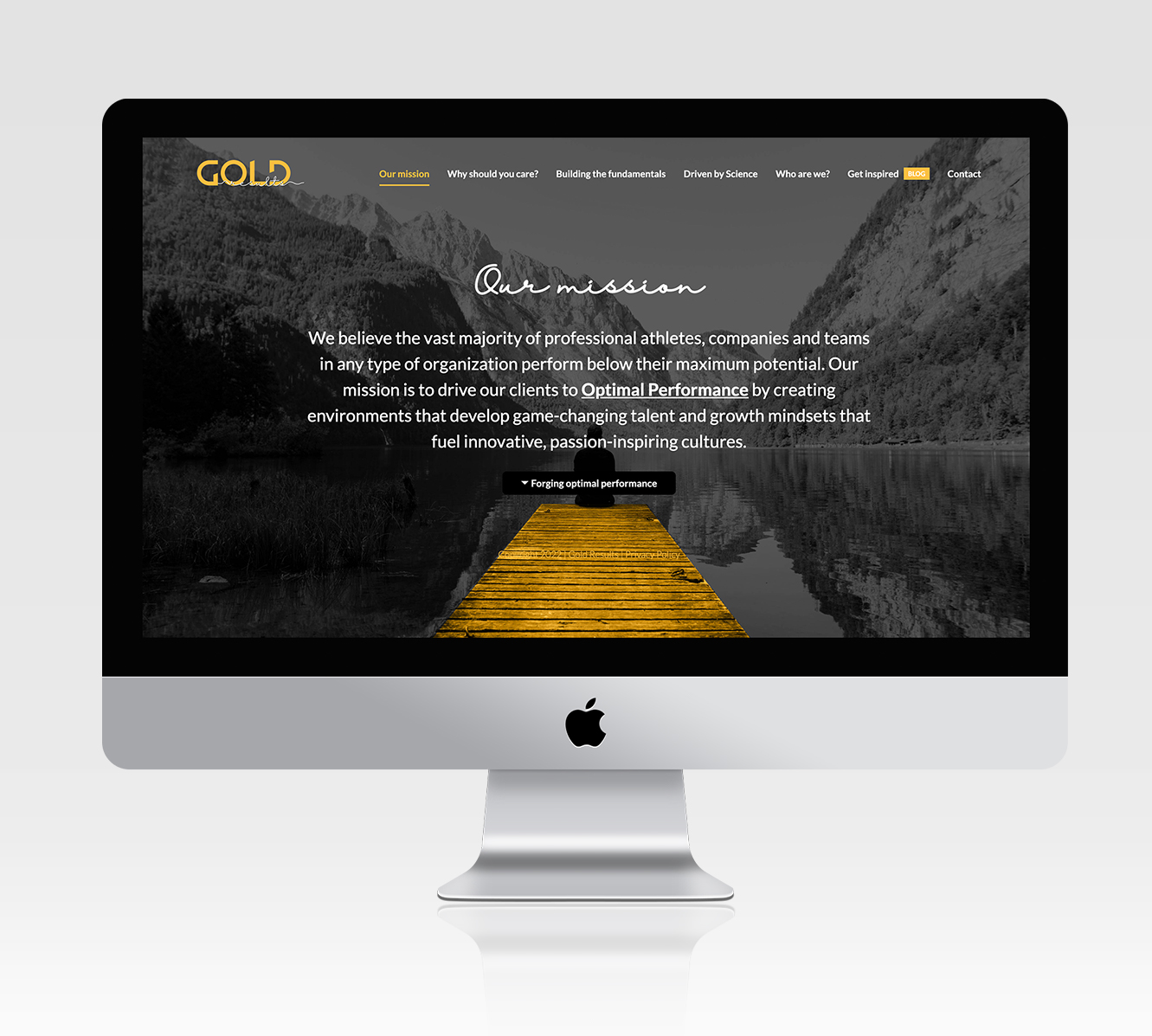
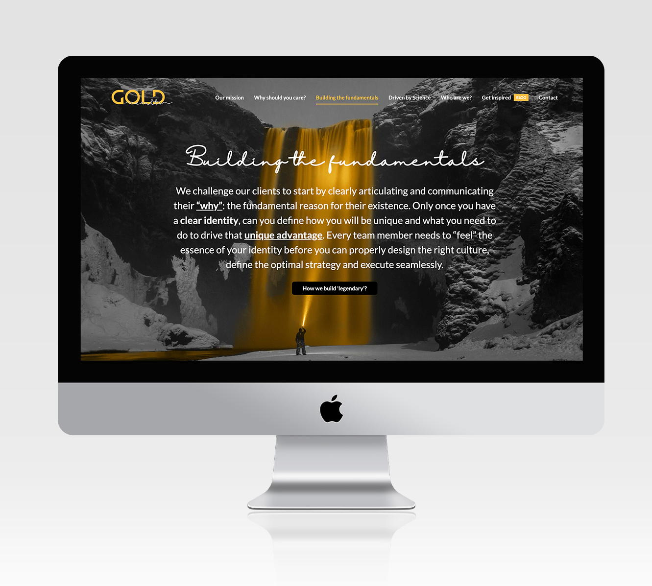
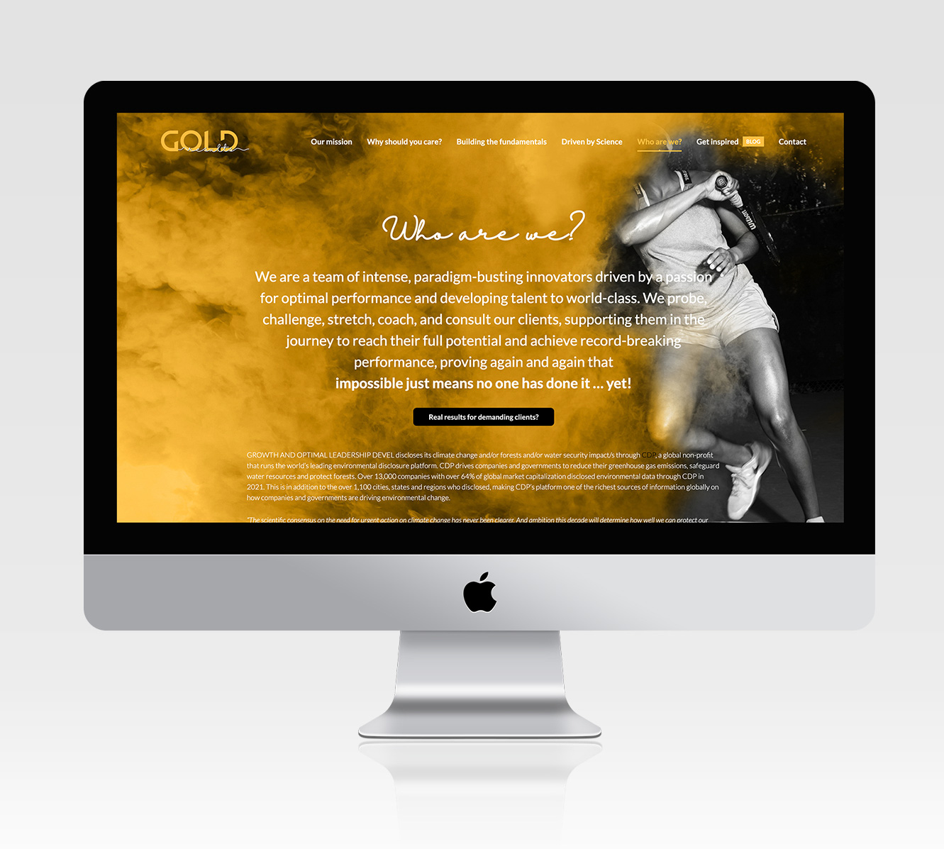
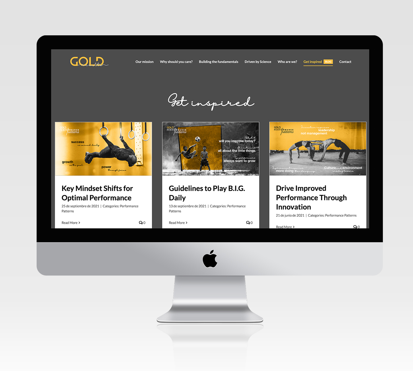
I created a decent website with focus on emotional, different images to make people curious about Gold Results and invite them to engage or get in touch. The blog section offers value content for people to engage around topoics related to Gold's values and principles.